I loved Resident Evil Revelations 2 when it released earlier last year. It still hadn’t quite captured that old school RE spirit, but it was easily the closest we’d gotten in years. I originally purchased it episode to episode on PlayStation 3 and then upgraded to the retail version on Xbox One later- and the huge leap graphically was awesome. The atmosphere and detail was really realized in the current gen version, and the lovely 60fps was a real treat after being locked before. Lots of little tweaks and changes really made the current gen release the best version to own. A few months later, Capcom brought the horror-action title to handheld with a release on PlayStation Vita, making it the first new title to be released on one of Sony’s handheld systems, despite the long-awaited (and canceled) Resident Evil: Portable. We never got around to covering it here on Rely, but now that we’re starting a new year, it’s time to change that and get some (very late) official word on our opinion of Capcom’s port of Revelations 2 to the handheld market.
The first clue I had that something was off was the dashboard icon for the game. The Vita’s main hub menu, where you can find all of your downloaded games, apps and more, has a sleek and Apple-inspired design. Most games take advantage of this by designing the icons for their games to look simple and cool on this dashboard. Silent Hill: Book of Memories is nothing but the Halo of the Sun glyph, and Minecraft is simply an image of the default hero, Steve.
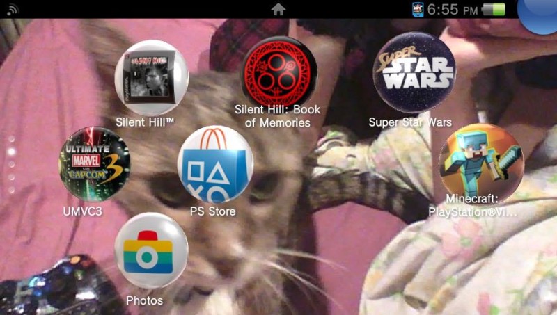
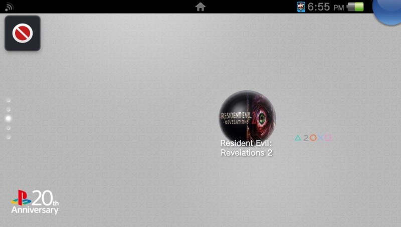
But Revelations 2… is some highly compressed version of the game’s box art, and it looks terrible. It’s squished and distorted– and the perfect analogy for this port.
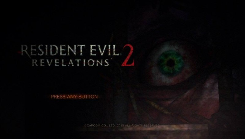
I won’t be reviewing the content of the Vita version of Rev2, as it’s identical to the other versions of the game. Same story, same levels, same item placement. No enhancements or special exclusives to this version have been made, save for a few new touch-screen controls to make up for the lack of buttons, and motion-sensitive aiming controls. This leads into one of the first problems you’ll notice booting up the game. Nothing has been changed from a design standpoint, the on-screen design is identical to that of it’s beefier console counterparts- designed for a Television set that can range from 19 to 60 inches wide, and almost every element of this design suffers greatly on the handheld. The text, the subtitles, the on-screen action, all seem tiny. The main menu suddenly seems bizarrely designed with such tiny text taking up a little space in the upper left corner- and the rest of the screen being essentially nothing at all. This wasn’t a problem on a Television, but on the smaller screen of the handheld it feels off and unwanted. Gameplay suffers an equally poor fate.
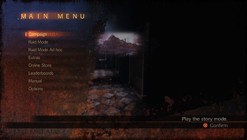
Just like the menus, the in-game camera has been left exactly the same, which leaves the player character seeming tiny and out of the way on screen. It doesn’t detract from the gameplay too much, but it feels awkward to control on a smaller screen. The fun really begins with the game’s in-game subtitles, which are Dead Rising levels of tiny. Why was none of this changed when moving to the smaller screen? It’s not like they couldn’t have known. I might sound like an old man, complaining about how small all of the text is, but it’s damn small.
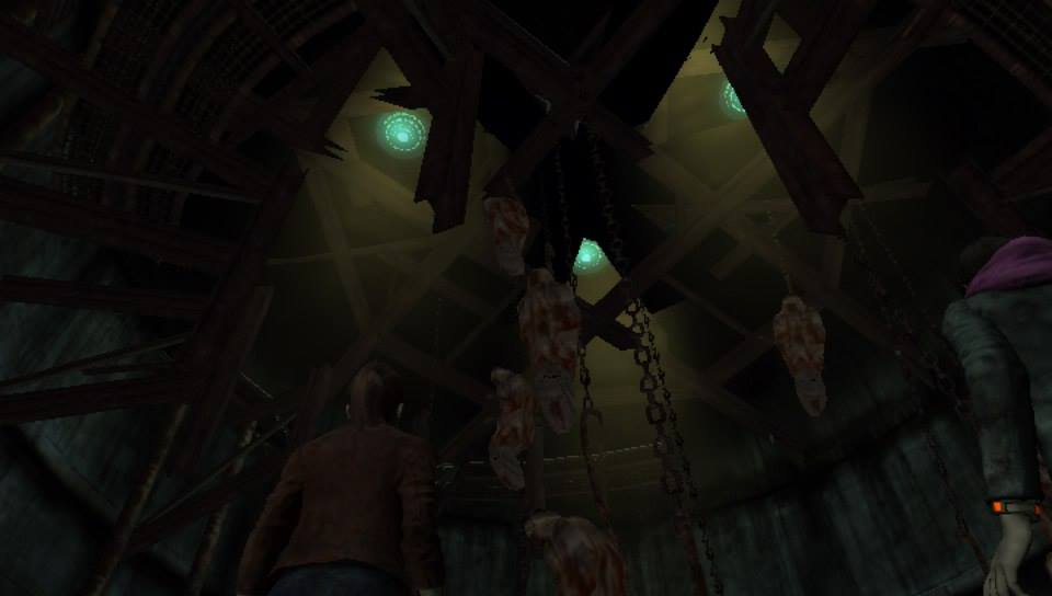
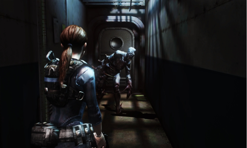
These are all nit-picky gripes so far, tho. These are things most anyone could probably get past if the rest of the port was fine. Right? Considering the Vita’s power, and how simple Revelations 2 looked to begin with, I was expecting something about on par with my PlayStation 3 experience with the game. Nope. It’s so, so much worse. The Vita is a powerhouse of a system, and has some amazingly beautiful games on it- Uncharted: Golden Abyss, Assassin’s Creed 3: Liberation, and many more. But Rev2 looks like a PSP game at some points. The opening cutscene looks fine, pretty HD visuals the same as what was on console, but the gameplay… oh dear. I am frankly stunned at how poor the gameplay looks. It would fit right at home on PSP system, save for the player character models. Claire, Moira, Barry, they all look fine. Clearly cut down- their eyebrows seem to almost just fade away into their face, and the lighting on them is less dramatic, leaving their features pale and blank looking. But I can more or less understand that. What I can’t understand is how unapologetically awful everything else looks.
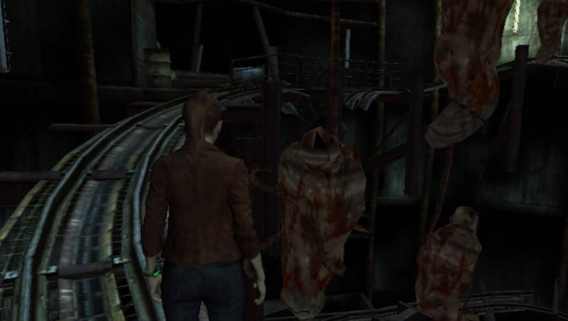
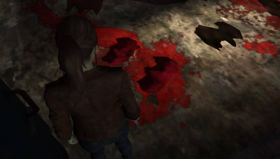
The enemy models, the blood, the gore, it all looks so amazingly bad. The blood is now bright, neon red and the piles of flesh and gore are now distorted, untextured lumps of red. The game’s main enemies, the Afflicted, aren’t as nicely polished as the player characters, looking muddy and flat. The lack of lighting for much of the game doesn’t help either, casting them in almost total darkness most of the time making them difficult to see at all. Moira has her flashlight, but she seems forgetful with it and rarely even turns the thing on outside of direct combat, which leaves the game miserably dark. A lot of effects are also missing, most notably the “security cam” filter that pops up now and again to let you know that the Overseer is watching you. Now these moments just appear normal like everything else, and the “being watched” feeling is simply gone. I also noticed that grassy areas, which make up much of the game, have some sort of glitchy mess going on. Layers of the grass texture seem to phase through each other, and it results in a distracting buzz near the character’s feet.
On top of the muddy visuals, the audio is miserable. The original game had amazing sound design and music, it was one of my favorite things about the experience, but the Vita version is so bit-crushed that the audio sounds like it’s coming through a sock. It’s muffled and low, everything from voices and music to even the gunshots, it sounds just as bad as it looks.
Next, the gameplay suffers from a deplorable framerate. Dipping in and out of sub-30 fps, sometimes what felt like sub-20, the game stutters along like a Netflix movie on a complimentary waiting room connection. This becomes unbearable during combat, when the (again, unchanged) tiny cross-hairs of your targeting reticle shambles across the screen to your target, leaving gameplay sometimes a full second behind your input. Headshots, or any other necessary accuracy is essentially impossible, and it becomes frustrating very quickly, especially with the experience of the superior console versions. This is a big issue as the game progresses, as needing to shoot enemies in their weak spots becomes a major gameplay mechanic for Barry’s portions. Sniper rifles become basically useless, and you end up resorting to things like the magnum for the longer distance shots. It’s even worse when you take damage- for some reason taking damage slows the framerate to a crawl, and if you get ganged up on you might as well just pause and reload because you just won’t be able to get out of it.

All of these issues are exacerbated by the frankly inexcusable load-times. The game took quite a while to load on console as well, but on a hand-held system, designed for being played on the go, it’s almost a deal-breaker all on its own. It can take upwards of a minute to load something, which when playing on a handheld system, might as well be an hour for how much it can pull you out of the game. Especially if you’re interested at all in the game’s supplementary feature, Raid Mode. This mode exists as almost a separate entity from the main game, using its own unique hub area to select characters, weapons and levels. But this comes at the cost of having to sit through at least 3 of these awful load times. One to boot up the game, one to boot up Raid Mode, and then another to actually load a single map to play on from Raid Mode. This isn’t even taking into account how long it takes the game to load in the character of your choice, which can be 10-20 seconds of just sitting there, waiting for Wesker or someone else to load so you can get to another load screen and then play. The console version did suffer from this same issue, but one would expect such a clearly downgraded port to maybe be able to cut back on the load times as well? Nope. It is the definition of unoptimized.
The final nail in this port’s coffin is its own lineage. Resident Evil Revelations on 3DS was so much better. An even 30fps framerate, sleek visuals that complimented the game’s design and place on a handheld system, and while a lot of it was about GameCube era in looks, it was the best of what the GameCube could have potentially offered. It looked better than Resident Evil 4 did on GameCube. Rev2 on Vita looks and plays worse than Resident Evil 4 did on GameCube. Even worse, when Revelations 1 was brought to consoles the following year, lots of changes and improvements were made to accommodate the upgrade. But nothing at all has been done to accommodate Rev2’s downgrade to Vita. Tiny text, ugly visuals, painful framerate, and an overall lack of polish makes the whole experience just unacceptable. The Vita has suffered some pretty awful ports in the past, The Amazing Spiderman comes to mind- but that was a much more complex and large game. There’s no reason that the Vita shouldn’t be able to handle Revelations 2’s corridors and mazes.
I really love Revelations 2, there was a lot of things that the original release did right. All of those things are trampled under the feet of this port’s problems, and I am frankly disappointed as hell with it.
 (2 / 10)
 (2 / 10)

 sisslethecat