When I first heard about Outbreak, a fan-made game designed to capture the feeling of the two Resident Evil: Outbreak games, I was overjoyed. Fans have created some amazing things over the years, and considering Capcom’s apparent disinterest in filling this particular niche, I was more than ready. The first fan-created Outbreak was a 2D top-down horror game that managed to capture the complex survival gameplay of the PS2 classics while working within the simplistic presentation of other indie darlings like Claire, Hotline Miami, and Lone Survivor. It was a great blend of ambition and ability. It worked, and it scratched that itch for fans of Capcom’s work good enough.
The sequel, Outbreak: The New Nightmare, is sadly an overreach of both ambition and ability.
The one-man development of Drop Dead Studios has opted to push the series into the third dimension, in an attempt to better resemble the games that inspired it. On paper, New Nightmare sounds simple and easy to enjoy. Take control of one of the several characters available who each have different perks and abilities, and attempt to survive the journey from one end of an area to the other. Flavor text helps flesh out the world around you, and simple puzzles mix up gameplay from an otherwise combat-focused style. A variety of guns and other weapons help keep you prepared (despite a small, 4-slot inventory) against hordes of the undead (and other Resident Evil-esque beasties) as you explore. It’s also possible to play with friends on Steam, but the Xbox One version lacks multiplayer of any kind.
The RE vibe is strengthened by many familiar visual and sound cues that would be right at home in the classic games, calculated to scratch that nostalgia for you. There’s also a remarkable amount of content considering the price: multiple maps, characters, modes, and difficulties should help you get the most bang for your buck. Overall, the level of passion the developer has for this style of game design is apparent, and the desire to make something other fans like themselves will be able to enjoy is palpable. But unfortunately, the intent is far outweighed by the simple inability to execute said passion in a 3D space properly.
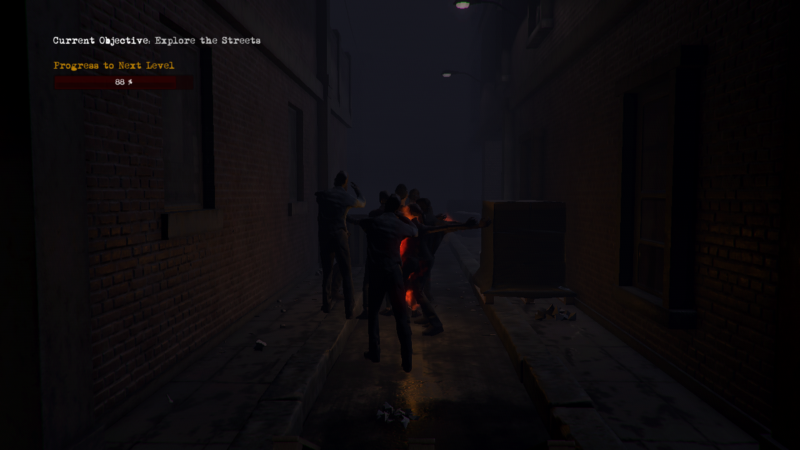
New Nightmare suffers practically every problem you can think of when it comes to the shift in scale. A few examples include stuttering framerates (nosediving into single digits in some of the larger maps), lag when opening and closing menus, buggy enemies that can damage the player through walls and doors, and inconsistent lighting that bleeds through barriers (while other areas remain too dark to see in). These are problems that are apparent and easy to appreciate as unacceptable inclusions in a full release. In other words, they can and should be fixed. Less easily described are more complicated issues with design, like the placement of the camera, model animations, and character movement.
The game tries to create a “classic” style camera system, with static camera angles that follow the character around an area until they exit the camera’s vision. This set up should be instantly familiar to fans of the genre, but it’s also not something that’s so easily replicated. In the original RE games, the camera was as conscious a design element as anything else, with each camera angle worked out. The maximum amount of visual real-estate was composed with an understanding of the way the area was laid out. While it was possible to miss information because of a particular angle, it wasn’t a mistake – it was a deliberate design choice to force the player out of his or her comfort zone and push them to explore further into a room so they could see as much of it as possible before moving on. It was a great way to set up scares or entice the player with an out-of-reach puzzle piece. If the player were to encounter a combat scenario, the camera design would bear this in mind, providing a more direct view of the room or hallway. It’s very rare to end up in a situation where you simply can’t see what you’re shooting at in the classic RE games, and impossible to end up in a scenario where the player isn’t visible. New Nightmare, on the other hand, understands none of this, or if it does, didn’t have the design wherewithal to execute it properly.
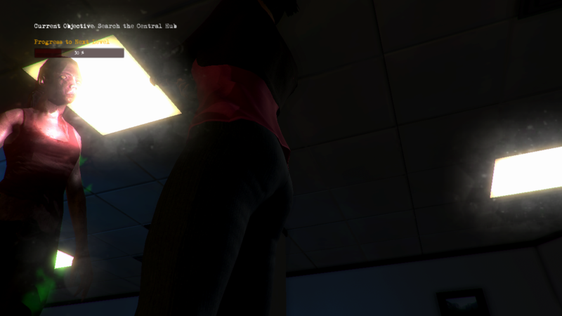
The camera in New Nightmare swings around uncomfortably and often seems to have no rhyme or reason to why it is set up in certain spots other than the developer thought it looked cool. The camera often loses track of the player or is positioned in a way that makes it difficult to tell what’s going on. There were several instances where I would end up in combat, and my character’s thighs or environmental objects would block the screen, preventing me from seeing my attackers or my escape route. Often, I would be unable to find a door due to camera placement, relying on the in-game map to figure out that there was more to explore just outside of the camera’s view. Even worse, somehow, were instances where the open door was positioned in such a way I couldn’t even tell where the actual opening was and had to just walk up against the wall for a bit until I passed through.
These problems aren’t helped by the player character’s awkward animation and slippery controls. Again, they’re designed to emulate the feeling of classic RE tank controls, but the intention of the game designer and the nature of the animations fight each other every step of the way. It feels clunky and hard to accurately judge movement, as the player feels like they’re moving too slow for how speedy the animations are (think running on ice). This becomes an issue when trying to set yourself up for combat, as the character navigates around a room with all the grace of an air-hockey puck.
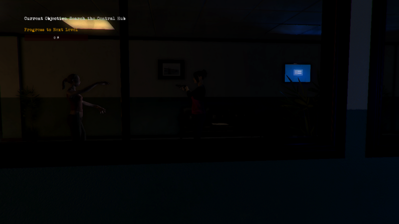
Now take this control problem and marry it with the camera issues, and the game becomes very close to unplayable. Sadly, you also have to remember to stack the horrible lighting, frame drops, and stuttering, and you’ve got yourself a product I simply cannot recommend in any way. I mentioned in a post about the game a while back that I understand that there are a lot of challenges faced when making a game. Especially as a one-man independent company, there are hurdles I can’t even imagine when making a project as ambitious as this. But that’s exactly what the problem is, and I pointed it out at the start of this review. Ambition did not match ability, and the game sadly suffers for it. I want nothing more in the world than to cut this developer a break; we deliberately set this game aside to review at a later date in hopes it would improve. Sadly, it didn’t improve enough. When this game is sold side-by-side with actual Resident Evil games on the digital storefronts that offer it, it’s impossible to say it’s worth your money, or your time.
 (2 / 10)
Bad
 (2 / 10)
Rely on Horror Review Score Guide
Xbox One review code was provided by the developer.


