I know I must be starting to sound like a broken record at this point, but god damn am I excited for RE7, and these new screens have my nostalgia mixing in as well.
Leaked from a closed conference with Capcom and Famitsu, these new screens show off a decidedly different side of Resident Evil VII: Biohazard than we’ve seen up until now. Most of RE7‘s visual marketing (trailers, screen shots, and even the Beginning Hour demo) have been mainly focusing on the incredibly dark, grungy, and overall REmake look that the game has. We’ve seen very little that would indicate any sort of bright lighting, or anything even coming close to clean. Finally, we’ve got a look at some areas that Capcom has been holding back on, as well as an element of gameplay I was not expecting to return.
Our first image is what I’m most excited about.
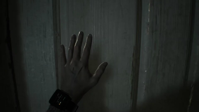
Up until now, we really had no idea how health would be working in RE7. Resident Evil has been trying a bunch of different things with it’s health systems recently, from the semi-circle of RE4 and 5, the blocks from RE6, and the simple “screen getting red and blotchy” thing from the two Revelations games. I had been assuming the latter would be returning for RE7, since that style is probably most associated with first person games. What I was not expecting was what we can see here on Ethan’s wrist. A small wrist-strap on his left arm that very clearly has an Electrocardiogram readout on it.
Yeah, if I’m not mistaken, the classic style ECG readout for monitoring health will be returning in RE7. Since RE7 has everything happening in “real time” (bringing up the inventory doesn’t pause the game, for instance), it actually works really well to have our health be something we would also have to physically check. I’m going to guess it will probably be somewhere in-between Isaac Clarke’s RIG health bar on his back (which was visible at all times) from the Dead Space franchise, and checking our watch in the original Dead Rising.
Probably pushing the View/Touchpad buttons (yes, the little “two squares overlapping” button on your Xbox One controller is called “View”, you’re welcome) on our consoles of choice will have Ethan bring his wrist up into full view, and we can check our health from here (or maybe he will just raise up his wrist when we check our inventory). Considering that, just like the original games, we’ll have to actually stop and check on our health, I’m going to also assume that Ethan will start limp (like the original games as well) when our health is low, or maybe there will be some sort of audio/visual indication (the strap might start blinking red, or start beeping, something like that- something noticeable that we can tell right away that we’ve only got a sliver of our health left). Since the ECG itself is returning, there’s probably a good chance all of it’s statuses are as well. Fine, Caution, and Danger are what it always was, classically, although Poison and Virus statuses would also pop up in a few of the games.
Either way, this is a really kickass throwback to the original games, and it has me even more in love with the direction this latest entry is taking.
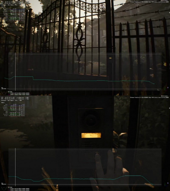
Our next two screens seem to be from an FPS test (that’s Frames Per-Second, not First Person Shooter), although that’s just my own speculation (I don’t know anything about tech PC stuff, just ask CJ). Here we get a look at that front gate that was shown to us during the “Bakers” trailer, locking the mansion off from the rest of the world. Ethan is shown ringing a “push to talk” doorbell, and I’m betting he probably doesn’t get an answer. This is obviously from pretty early in the game, and (speculation time!) I think he probably either gets no answer, or gets told to push off, so he looks around in the woods (which we’ve seen a few times now in screens and trailers) for a backway in.
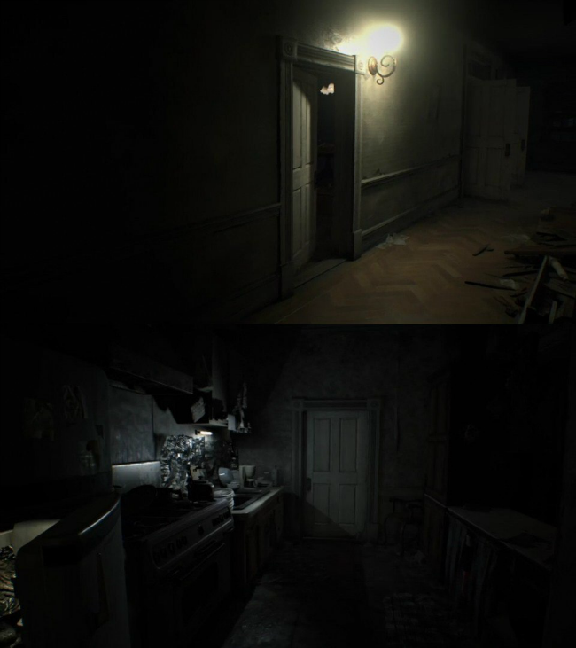
The top image is nothing to write home about really, although it looks like it might be from around where Jack Baker (The Family Man) busts through the wall Mr. X style in the “Bakers” trailer. The bottom image is more interesting, to me at least. What I think we’re looking at here is the kitchen we saw during that trailer, just beyond the dining room where Lucas, Jack, and Marguerite were taunting us with their “special feast”. The little opening we see on the right side of the image lines up, and you can even see the tube light in the background.
These next couple of images start tickling my nostalgia jimmies again, and I’ll tell you why once I’m done explaining them.
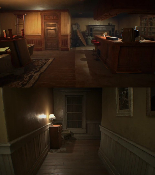
This part of the mansion looks very different from anything we’ve seen so far. Bright, warm, colors, and it actually seems pretty clean, and well organized. It sort of looks like a bar, or a rec room. Honestly, it’s so nice looking I’m not 100% convinced it’s actually in the mansion, although you never know. If it isn’t, maybe this is where the game starts? Kawata stated that it would begin someplace we wouldn’t expect, maybe Ethan works at and (based on the equally okay looking hallway image with it) lives above a bar? That picture frame does looks pretty damn smashed though, and there’s some cloth or something near the chest of drawers. Who knows.
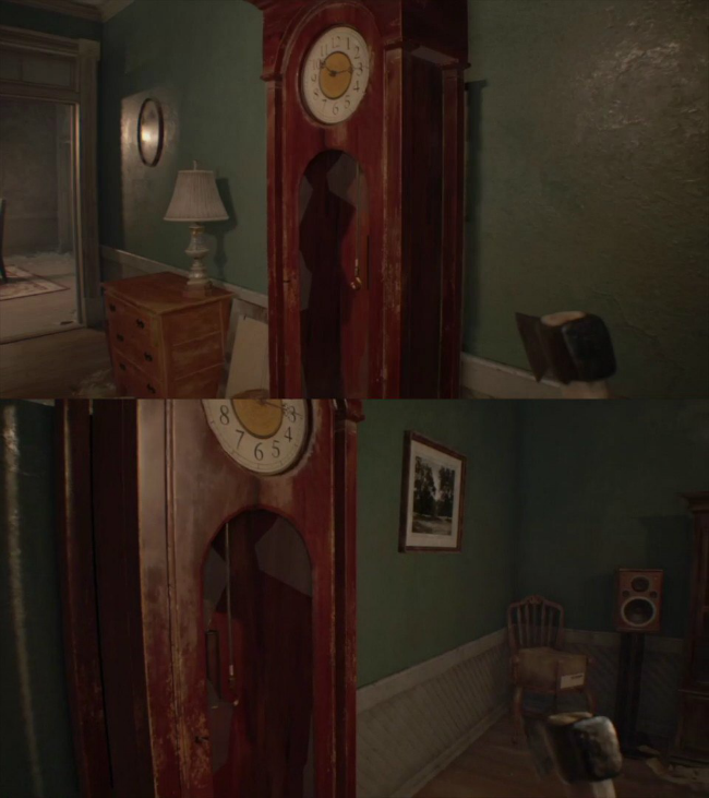
Again, I’m not 100% sure where we are here. The smashed grandfather clock (not to mention Ethan is wielding an axe) feels like we must be in some part of the mansion, and in danger, but the otherwise pretty clean and nice look to everything (not to mention the standing speaker we can see in the bottom image) would suggest that we’re somewhere else. These images might not be 100% representative of the final game of course, and the axe could just be part of whatever this demo is that was shown to Famitsu. My personal theory is that none of this is inside the mansion, and instead in Ethan’s apartment, or house, or whatever. But I could be totally wrong.
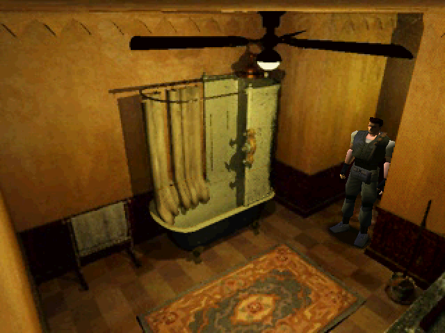
So as to why it’s getting me all nostalgic, it’s pretty simple, actually. It looks like Resident Evil. Not the franchise as a whole, but the original, 1996 Resident Evil. While the series almost immediately adopted a very cluttered, lived-in look with Resident Evil 2 onward, focusing on trying to tell stories of the people that had lived in the places we were surviving in before the outbreak, the original game (either due to technical or budget limitations, or just a different artistic direction) has a very sterile, clean, and warm look. Rooms were often very empty feeling, and had little to now decoration (although that EXCITE ’98! poster still makes me giggle a little looking at it). Comparing the two, I really do feel like that’s sort of what they were going for here.
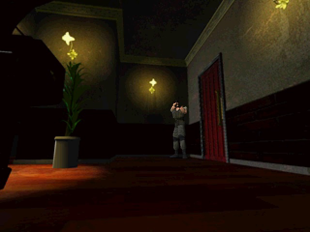
It was very alien, and weird feeling in the original game, how incredibly untouched the mansion felt. Sure, in the beta version of the game there was supposed to be writing on the walls and blood everywhere, but the final game felt like you were almost in… I dunno, like a set or something. One of those fake towns they built during the cold war to test nuclear weapons on. It was unsettling as hell, and I’ve never really been sure why it worked so well when literally all of the games that followed it went for a much more trashed, lived-in look. While it’s effective and incredibly immersive to watch little puffs of dust cloud up around our feet walking through the mansion, or casting long shadows on the walls in REmake, it’s somehow more unsettling (to me, at least) to have none of that. It made the mansion feel… inhuman, more so than a building could be. I can’t really put my finger on it. But regardless, this exact same color pallet and tone seems to be emanating from these screens, and I welcome it with glee.
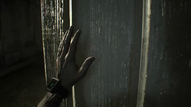
Our final screen is maybe a little boring at first glance, another look at our new iECG or whatever it’s called, as Ethan opens yet another door. Taking a more careful look at it, however, you’ll notice something… a little messed up. Ethan seems to have a line of stitches running around his forearm, just below his wrist, like his hand was torn off, and then sown back on. First thing that comes to mind is Lucas Baker getting a pretty viscous slice in more or less the exact same place during the “Bakers” trailer, which is interesting. I’m not sure what to make of it. Maybe we aren’t even playing as Ethan here? Only time will tell.
That about wraps it up for now, although presumably Famitsu will have a full article and more information on these images soon. It’s October, which is international spooky scary month (doot), and I’m sure Capcom won’t let a chance to scare up a little more advertising during our favorite time of year slip by.

 sisslethecat