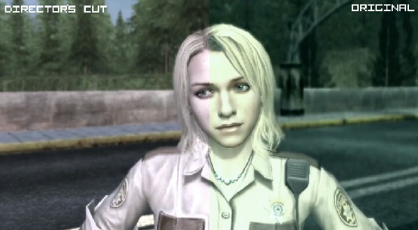
A lot of people have been wondering how the new Deadly Premonition Director’s Cut visuals stack up to that of the original Xbox 360 release. More notably to see if the Director’s Cut framerate is as poor as some people have been reporting. Thanks to supergreatfriend on Youtube, we can finally see the two games side by side, and draw our conclusions from there.
The most noticable difference is the removal of the green filter in the Director’s Cut, that and the framerate does chug a few times in the new iteration of the game. Also, strangely enough, in the Director’s Cut, it appears they removed the flowing water effects entirely from the river, and the new water in the Director’s Cut look pretty awful.
Maybe it’s just the video, but overall, the new release doesn’t look much better than the original release so much as it just looks slightly different, and in some cases, even worse. It’s a shame that it didn’t look and perform better in every regard, after all this release is coming out 3 years after the original game and costs twice as much now than it did back then. Either way, I’m sure the Director’s Cut still looks better in other areas of the game. Watch the video for yourself below!

[Source]


