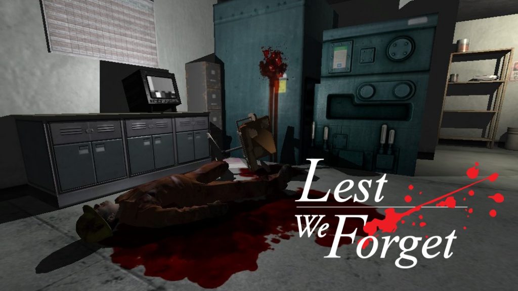
 We here at Rely on Horror love horror games and game design in general. To celebrate both of these things, we will be publishing a book that will be a new series of editorials here, titled Lest We Forget. Each month will bring two new examinations of narrative and game design in horror games. To celebrate the 13th anniversary of the F.E.A.R. franchise, we take a look at one of the things that made the original game so special: its environments.
There are no games quite like the original F.E.A.R. A unique blend of pre-Modern Warfare military shooter, Matrix-esque slow motion, and Japanese horror influences, F.E.A.R. remains one of the best first-person horror games of all time. People often focus on F.E.A.R’s well-paced encounter design, satisfying gunplay, and clever story, but what truly sets Monolith Production’s classic shooter apart are its environments. From corporate cubicles to shadowy sanitation plants, the environments in F.E.A.R. are entirely mundane, and that’s precisely why they work so well in a horror game.
Like any good corporate horror story, F.E.A.R. starts with an experiment gone wrong. Paxton Fettel, a psychic commander raised from birth to mentally control an army of super soldiers, has gone rogue. The player takes the role of an operative working for F.E.A.R., an elite military unit that specializes in paranormal operations. For most of the game, the player has one objective: eliminate Paxton Fettel at all costs.
On its surface, the story of F.E.A.R. is silly. Super soldiers and psychic commanders? Absolute tosh, to be sure. But the game plays its mysteries straight, and it works — not just due to a competent script and scares, but because the environments the player traverses are so damn boring. Yes, boring. They are boring, incredibly believable, and are more unsettling for both of those qualities.
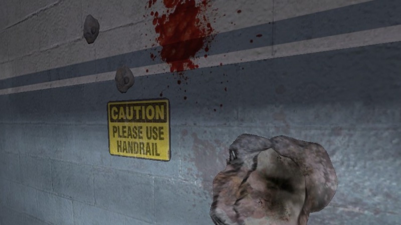
After a brief prologue, players find themselves within a water treatment facility. The level design goes through winding concrete corridors before spitting them into multi-layered combat arenas that allow players to take full advantage of F.E.A.R.’s unique slow-mo mechanics and expansive arsenal. The entire game repeats this formula, with occasional ghost-girl sightings thrown in for good measure.
Good environment design is more than just designing engaging levels. It isn’t merely a matter of how useful the environment is to the player, but also how useful it is to the narrative. It’s an intersection of art design and level layout. It relies on alternating enemy encounters with quiet moments that allow the player to catch their breath, and take in the sights as well. It’s in these moments that F.E.A.R. builds its unforgettable atmosphere.
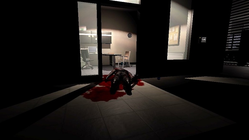
The water treatment area is meant to feel like an otherwise dull industrial zone in the midst of a horrifying tragedy. The placement of bloodied bodies and a few supernatural scares keeps players on their toes. There’s a subliminal message in these surroundings, hinting that nothing is what it seems in a place that should be utterly unremarkable. The unsettling nature of F.E.A.R.’s environments doesn’t hit a fever pitch, however, until the player reaches the Armacham headquarters.
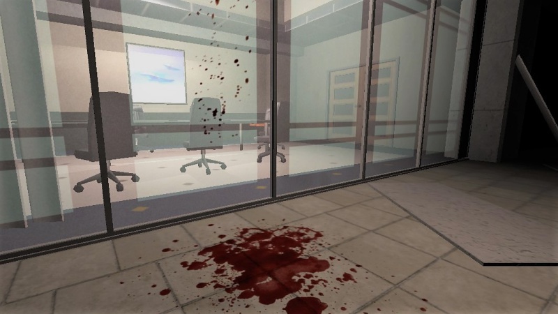
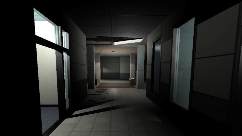
The visual staples of any standard office job, ingrained in the collective American consciousness, exist here; offices with mass-manufactured desks and chairs, breakrooms that all have the same microwaves and vending machines, and labyrinthine hallways vacuumed nightly. Everything about the offices in F.E.A.R. perfectly emulates the sterile, uniform workplaces that everyone is familiar with.
When you first walk through the pitch black hallways of the office areas, something just feels off. Death lingers in the air, accompanied by a subtle musical score created for the sole purpose of setting players on edge. Looking through the detailed environments, you can still see evidence of life; magazines and food containers remain, left behind after a busy workday. In the context of a game, they’re simple assets, placed meticulously to fly across the player’s screen when stuff starts blowing up. But in the narrative they help form, they represent so much more; they are relics from a world the player is being forced to leave behind.
In 2005, F.E.A.R. was lauded for its visual detail. On the surface, similar environments occupy the background of games like Max Payne, BLACK, and the Rainbow Six Series. But with the jump in graphical horsepower seen on PC and the advent of the XBox 360, F.E.A.R. was able to push the limits in ways that hadn’t been readily available up to that point. Smaller details like bottles, food containers, and other random junk could now be interacted with, adding depth rarely seen in first person games.
F.E.A.R.’s legacy has been one of fast-paced action, its status cemented by the general expectations of games when it released. At the time, many reviews didn’t like the level design; as I mentioned before, they are relatively similar to other games of the era. But looking back 13 years later, F.E.A.R.’s environments are unique in their ability to create tension. By combining military shooter tropes with action cliche environments, it sells itself as a run-of-the-mill shooter game with some spooky elements. Then, by using a visual language that is familiar to everyone and details that breathe life into otherwise sterile surroundings, F.E.A.R. manages to twist the mundane into the unforgettable.
